Your parks need you now
Your support helps fight climate change and promote park sustainability—please give now.
Michael Schwab print joins roster of iconic Golden Gate National Parks images
When they were first released in 1995, graphic artist Michael Schwab’s iconic Golden Gate National Parks images were immediately popular around San Francisco. So popular, several posters were stolen from the bus shelters where they premiered.
Today, there are many less-controversial ways to get the popular images. And the newest image might be the most iconic yet.
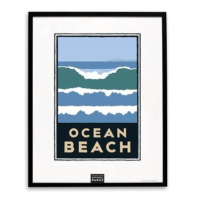
Ocean Beach has gotten the Michael Schwab treatment with a gorgeous print now available in park stores and online.

The crashing waves and coastal colors of the new print will have broad appeal for anybody who loves spending time at the beach, whether at our 3.5-mile stretch along the Pacific Ocean or anywhere else around the world.
“This new Ocean Beach design is meant to be simple and iconic,” Schwab said. “It’s all about the beach. The water. The waves. Nature. Proud. Poetic.”
The Ocean Beach image is the 21st in the series, which started with the famous Golden Gate Bridge image in 1995. Later that year, the parks released images for Alcatraz, Muir Woods, the Presidio, Lands End, the Marin Headlands, and Fort Point.
The original intent of the campaign, as conceived by Parks Conservancy President & CEO Greg Moore and longtime board member Rich Silverstein, was to unify the Golden Gate National Parks under one brand identity, while still highlighting the individual beauty of each site.
Silverstein had particular expertise with Goodby, Silverstein and Partners, the agency responsible for the famous “Got Milk” ad campaign and many others. Silverstein organized the parks campaign pro bono, tapping Schwab to put his timeless style on the design. Schwab has designed powerful images for the America’s Cup and Major League Baseball All-Star Game in San Francisco, Peet’s Coffee, and Amtrak, among others. By all measures the parks campaign has been a wild success. The images are seen on prints, coffee mugs, patches, and water bottles around the Bay Area and the world.
And the themes of the series are seen in other, less-obvious spots around the parks. If you’ve ever taken a close look at the large signs welcoming visitors to the Presidio and other spots, you’ll notice the same capital-letter typography from the posters. The typography was originally hand-lettered by Schwab, giving a natural feel to the design across the series and the signage.
Originally the campaign was limited to three colors, plus black, for each print and T-shirt, a challenge Schwab enjoyed.
“That limitation actually created more graphic drama,” Schwab said. “I also wanted to somehow honor the presence of the military history of the parks so I added gray to all of the colors. It created a unique, earthy and vintage effect throughout the family of images.”
Ocean Beach is still one the best spots in the parks for a sunset stroll, but not the best place for a swim. See our other E-ventures article on the dangers of swimming at Ocean Beach.
But for gazing at the waves and contemplating life, there’s no better place in the parks. And now there’s a print capturing that essence, so you can do the same gazing in your living room.
Your support helps fight climate change and promote park sustainability—please give now.